

Hei! Sunt Anda — UI/UX designer și problem solver digital
Sunt un designer curios, format din practică, care se entuziasmează la un UX bun și la momentul ăla în care „totul se leagă”.
Am lucrat cu peste 100 de clienți — de la fondatori solo la echipe SaaS — construind site-uri și produse clare, intuitive și gândite pentru oameni reali.
Deși am dus multe proiecte cap-coadă pe cont propriu, îmi place mult munca în echipă și mă adaptez ușor în orice tip de workflow.
Câteva Cuvinte Pe Scurt
La ce mă pricep
Nu am venit dintr-o școală de design — am învățat făcând. Am lucrat pe proiecte reale, am testat mult, am greșit, am ajustat și mi-am construit reputația pe claritate, viteză și intuiție. Astăzi lucrez ca designer independent, unde mă ocup de tot: de la user flows și prototipuri, până la SEO, structură și design mobile-first. Cred că UX-ul bun pornește din empatie, se rafinează prin testare și devine mai bun cu fiecare iterație. Și da — chiar îmi place Figma.
Ce fac, concret:
-
Design UX/UI pentru site-uri și produse digitale
-
Implementări în Webflow și Wix Studio
-
Wireframe-uri, prototipuri și user journeys
-
Structuri clare, prietenoase cu SEO
-
Identitate vizuală și micro-interacțiuni
-
Colaborare directă 1-la-1 — ești parte din proces

Rezumat Experiență
Rol actual
UI/UX Designer @ Vector Developers
Experiență
5+ ani în B2B, SaaS, evenimente și servicii
Educație
Administrarea Afacerilor – ASE București
Limbi
Engleză (fluent), Română (nativ)
Certificări
Web Design, WordPress, UX Testing
Portofoliu din culise
O selecție de proiecte în care nu arăt doar rezultatul final, ci și gândirea, structura și deciziile din spatele designului.
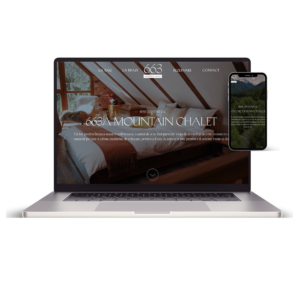
663A Chalet — proiect creativ, în lucru
Un site cu o abordare mai artistică, construit în jurul atmosferei și al storytelling-ului vizual.
Am mizat pe imagini mari, ritm tipografic și spațiu negativ pentru a transmite liniște și simplitate.
UX-ul e intenționat aerisit — gândit să te țină în stare, nu să te grăbească spre o acțiune.
Momentan rafinez scroll-ul, micro-interacțiunile și echilibrul layout-ului pe diferite rezoluții.
Uneori, designul bun nu înseamnă să rezolvi repede — ci să încetinești.
ANDEAN ODYSSEYS
Un website curajos și imersiv pentru o agenție de travel care organizează experiențe unice în Peru.
Designul pune accent pe imagini puternice, navigare intuitivă și un flow clar, care lasă destinațiile să vorbească.
Am combinat storytelling-ul cu performanța — fiecare secțiune echilibrează emoția cu claritatea, ghidând utilizatorii de la inspirație la acțiune.
O călătorie bună începe cu o experiență digitală bine făcută.

MENTADO
Un site calm și bine structurat pentru o clinică de sănătate mintală.
Focusul a fost pe încredere, reducerea încărcării cognitive și acces rapid la informația corectă.
Am lucrat mult la ierarhia conținutului, structura de FAQ și fluxurile de programare, astfel încât navigarea să fie simplă și naturală.
SEO-ul a fost integrat din start, fără compromisuri pe UX.


Construit pentru oameni. Optimizat pentru căutare.
UX și SEO merg mână în mână. Mă asigur că structura, heading-urile și fluxul de conținut funcționează atât pentru utilizatori, cât și pentru Google.
-
Structură HTML semantică (H1–H6, ierarhie clară)
-
Titluri, meta descrieri și OG-uri optimizate
-
Performanță bună: mobile-first, layout curat, viteze bune
-
Link-uri interne și structură de conținut logică
Mai mult decât UI
Munca mea nu se oprește la site-uri. Designul ajunge și în social media, campanii și materiale vizuale — aici e o selecție din ce am creat pentru a aduce brandurile la viață.
KARST ISVERNA MTB RACE - Flyere
Flyerele au fost gândite pentru un eveniment de MTB unde mesajul trebuie să ajungă rapid și clar, indiferent dacă le vezi online sau tipărite. Am lucrat cu o estetică puternică, contrast mare și o ierarhie tipografică foarte clară, astfel încât informațiile esențiale — dată, locație, înscriere — să fie ușor de scanat dintr-o privire.
Am pus accent pe structură, ritm vizual și consistență, astfel încât fiecare material să fie recognoscibil instant, dar suficient de flexibil pentru diferite formate și contexte. Design-ul nu e doar „frumos”, ci funcțional și orientat spre utilizator.
Totul trebuia să se simtă rapid, concentrat și curajos — exact ca energia cursei.

ROOM 119 - Video secțiune principală
Pentru Room 119 am creat un video scurt, gândit ca un teaser de brand, nu ca un simplu element decorativ. Brandul are o identitate puternică și asumată, așa că focusul a fost pe atmosferă, ritm și personalitate.
Am lucrat cu text animat, influențe retro și tranziții curate, astfel încât video-ul să capteze atenția fără să devină obositor. Fiecare cadru, fiecare mișcare și fiecare pauză au fost gândite intenționat, pentru a susține tonul brandului.
Rezultatul: un hero video care setează vibe-ul din primele secunde și te face să vrei să continui scroll-ul.

Karst Isverna – Social Media
-
Un set complet de vizualuri pentru Instagram și Facebook, construit ca un tot unitar, nu ca postări individuale aruncate în feed. Am acoperit tot parcursul evenimentului — de la anunțuri și countdown-uri, până la informații utile și comunicarea din ziua cursei.
-
Design-ul a urmărit să creeze energie și coerență, folosind culori puternice, layout-uri modulare și o tipografie clară, ușor de adaptat pe mai multe formate. Scopul a fost să păstrăm mesajele simple, dar impactante, și să menținem aceeași identitate vizuală pe tot parcursul campaniei.
-
De la primul anunț până la finish line, fiecare postare a fost parte din experiență — nu doar „content”.

