Hey! I’m Anda — UI/UX designer & digital problem solver
I am a curious, self-taught designer who geeks out over good UX and lives for that “aha!” moment when everything just clicks. I’ve worked with over 100 clients — from solo founders to cross-functional SaaS teams — designing websites and products that are clean, intuitive, and built with real users in mind.
While I’ve led many projects independently, I thrive in collaborative setups and love jumping into team workflows, no matter the size.

About Me
I didn’t start in design school — I learned by doing. I got my hands on real projects, figured things out fast, and built a reputation for clarity, speed, and intuition. Today, I run my own design practice where I handle everything from user flows and prototyping to SEO optimization and mobile-first design. I believe great UX starts with empathy, evolves through testing, and gets better with every iteration. And I really like Figma.
What I Do
-
UX/UI Design for websites & digital products
-
Webflow & Wix Studio builds
-
Wireframes, prototypes & user journeys
-
SEO-friendly layouts & structure
-
Visual identity & micro-interactions
-
One-on-one client collaboration — you’re part of the process
Experience Snapshot
Current Role:
UI/UX Designer @ Vector Developers
Experience:
4+ years across B2B, SaaS, Events, Services
Education:
BA in Business Administration, ASE Bucharest
Languages:
English (fluent), Romanian (native)
Certificates:
-
Web Design, WordPress, UX Testing
Explore My Core Skills
A quick preview of the three main areas where I bring the most value — from UX design to content visuals and SEO that works quietly in the background.
Portfolio Behind the Screens
A selection of projects where I share not just the final look — but the thinking, structure, and decisions that shaped the UX and UI along the way.

VECTOR DEVELOPERS
-
This is our agency website, where I led the entire UX/UI design process — from structure to visuals. I created user flows focused on guiding visitors toward our main goal: requesting a quote. The layout is built on a clear content hierarchy, with high-converting CTAs, a simplified navigation structure, and a responsive design system that works across devices.
-
Visually, I focused on a clean, modern interface that reflects our brand, while keeping performance and clarity in mind. I also applied UX writing, micro-interactions, and intuitive spacing to make the experience feel both professional and friendly.
Before designing for 100+ clients, I practiced on us. Fair deal, right?

MENTADO
-
A calm, structured website for a mental health clinic — designed to build trust, reduce cognitive load, and make it easy for users to find the right type of support. I focused on content hierarchy, FAQ structure, and a clear service breakdown, so users could navigate with minimal effort.
-
The interface is warm, accessible, and fully responsive, with clear booking flows and easy-to-scan text blocks. I also implemented SEO best practices from the start: correct heading structure, internal linking, and layout decisions made for both users and Google.
Because mental health starts with feeling seen — and that includes your website.

EDWARD BOND
-
For this UK-based accountant, I designed a professional and trustworthy website that puts clarity first. I focused on content structure, helping visitors quickly understand services and get in touch — without unnecessary clicks.
-
The layout is minimal, with strong visual hierarchy, clean spacing, and SEO-ready formatting. Every section is purpose-built: from introducing the business to building credibility and offering clear conversion paths for inquiries.
Because sometimes the best design just gets out of the way — and lets the content do the talking.

663A CHALET (in progress)
-
A more atmospheric and creative build, this project blends visual storytelling with a minimalist layout to reflect the character of an isolated mountain retreat. I focused on creating a mood-driven interface, using large visuals, typographic rhythm, and negative space to evoke stillness and simplicity.
-
The UX here is intentionally light — meant to draw users in emotionally rather than rush them to action. I’m currently refining scroll behavior, subtle microinteractions, and layout balance across breakpoints.
Sometimes design isn’t just about solving — it’s about slowing down.

SEBVET - HAPPY PET
-
A friendly, service-focused website for a veterinary practice — designed to be simple, welcoming, and easy to update. I created a layout that’s client-oriented, with clearly defined service sections, quick contact access, and smooth mobile performance.
-
The design uses gentle color contrasts and a straightforward visual hierarchy to make it approachable for pet owners. Behind the scenes, I structured everything with SEO in mind and made sure the experience feels light, clear, and functional on any device.
Because even pet owners need good UX when they’re in a rush.

“Use this space to share reviews from customers about the products or services offered.”

VECTOR DEVELOPERS
-
This is our agency website, where I led the entire UX/UI design process — from structure to visuals. I created user flows focused on guiding visitors toward our main goal: requesting a quote. The layout is built on a clear content hierarchy, with high-converting CTAs, a simplified navigation structure, and a responsive design system that works across devices.
-
Visually, I focused on a clean, modern interface that reflects our brand, while keeping performance and clarity in mind. I also applied UX writing, micro-interactions, and intuitive spacing to make the experience feel both professional and friendly.
Before designing for 100+ clients, I practiced on us. Fair deal, right?

MENTADO
-
A calm, structured website for a mental health clinic — designed to build trust, reduce cognitive load, and make it easy for users to find the right type of support. I focused on content hierarchy, FAQ structure, and a clear service breakdown, so users could navigate with minimal effort.
-
The interface is warm, accessible, and fully responsive, with clear booking flows and easy-to-scan text blocks. I also implemented SEO best practices from the start: correct heading structure, internal linking, and layout decisions made for both users and Google.
Because mental health starts with feeling seen — and that includes your website.

EDWARD BOND ASSOCIATES
-
For this UK-based accountant, I designed a professional and trustworthy website that puts clarity first. I focused on content structure, helping visitors quickly understand services and get in touch — without unnecessary clicks.
-
The layout is minimal, with strong visual hierarchy, clean spacing, and SEO-ready formatting. Every section is purpose-built: from introducing the business to building credibility and offering clear conversion paths for inquiries.
Because sometimes the best design just gets out of the way — and lets the content do the talking.

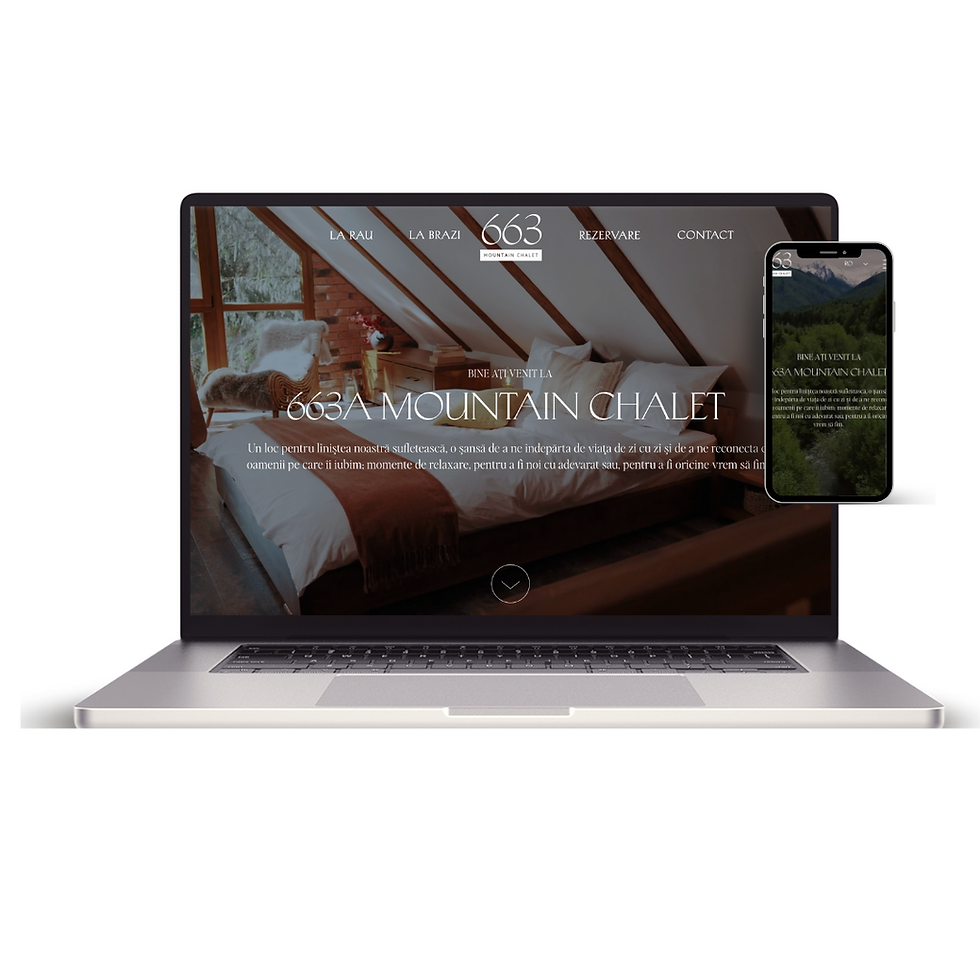
663A CHALET - something artsy as well (still working)
-
A more atmospheric and creative build, this project blends visual storytelling with a minimalist layout to reflect the character of an isolated mountain retreat. I focused on creating a mood-driven interface, using large visuals, typographic rhythm, and negative space to evoke stillness and simplicity.
-
The UX here is intentionally light — meant to draw users in emotionally rather than rush them to action. I’m currently refining scroll behavior, subtle microinteractions, and layout balance across breakpoints.
Sometimes design isn’t just about solving — it’s about slowing down.

SEBVET - HAPPY PET
-
A friendly, service-focused website for a veterinary practice — designed to be simple, welcoming, and easy to update. I created a layout that’s client-oriented, with clearly defined service sections, quick contact access, and smooth mobile performance.
-
The design uses gentle color contrasts and a straightforward visual hierarchy to make it approachable for pet owners. Behind the scenes, I structured everything with SEO in mind and made sure the experience feels light, clear, and functional on any device.
Because even pet owners need good UX when they’re in a rush.
Built for Humans & Search Engines
UX and SEO go hand in hand — I make sure the structure, headings, and content flow work for both people and Google.
SEO Optimization – What I Actually Do
-
I approach SEO as part of the design process — not an afterthought. Every website I build is structured with searchability, clarity, and performance in mind. My SEO work includes:
-
Semantic HTML structure: Proper use of H1–H6, clear content hierarchy, and scannable layouts
-
Metadata optimization: Titles, meta descriptions, OG tags, and alt text for accessibility and shareability
-
Page performance: Optimized assets, mobile-first design, clean code, and layouts that score high on Core Web Vitals
-
Internal linking and content strategy: I help clients organize their content in a way that benefits both users and crawlers
More Than UI
My work also lives on social, in campaigns, and across content — here’s a glimpse of the visuals I’ve designed to bring brands to life.

KARST ISVERNA MTB RACE - FLYERS
-
Designed a bold, high-contrast flyer for an outdoor cycling event, balancing visual impact with clear event details. I focused on typographic hierarchy, color contrast, and content framing to make essential info (date, location, registration) instantly scannable.
The design uses layered text, a QR code CTA, and dynamic layout to attract attention both digitally and in print.
It had to feel fast, focused, and fearless — just like the race

ROOM 119 - BRAND HERO SECTION VIDEO
-
This is our agency website, where I led the entire UX/UI design process — from structure to visuals. I created user flows focused on guiding visitors toward our main goal: requesting a quote. The layout is built on a clear content hierarchy, with high-converting CTAs, a simplified navigation structure, and a responsive design system that works across devices.
-
Visually, I focused on a clean, modern interface that reflects our brand, while keeping performance and clarity in mind. I also applied UX writing, micro-interactions, and intuitive spacing to make the experience feel both professional and friendly.
Before designing for 100+ clients, I practiced on us. Fair deal, right?

Karst Isverna – Social Media Visuals
-
Designed a full set of Instagram & Facebook visuals to promote Karst Isverna MTB Race — including countdowns, giveaways, and race info posts. I worked with a bold visual identity, using color contrast, modular layouts, and clear typography to make key info pop across all formats.
-
The goal: build excitement, keep communication clear, and stay consistent with the event’s brand tone — sporty, energetic, and proudly local.
From announcement to race day — every post was part of the ride.

“Use this space to share reviews from customers about the products or services offered.”

KARST ISVERNA MTB RACE - FLYERS
-
Designed a bold, high-contrast flyer for an outdoor cycling event, balancing visual impact with clear event details. I focused on typographic hierarchy, color contrast, and content framing to make essential info (date, location, registration) instantly scannable.
The design uses layered text, a QR code CTA, and dynamic layout to attract attention both digitally and in print.
It had to feel fast, focused, and fearless — just like the race

ROOM 119 - BRAND HERO SECTION VIDEO
-
Created a short motion-driven visual teaser for Room 119 — a bold, concept-led brand that sells posters and prints. I focused on delivering a strong visual identity, using animated text, a retro aesthetic, and rhythmic pacing to highlight the brand’s tone: quirky, confident, and unapologetically niche.
-
From layout to transitions, every element was built to feel intentional, scroll-stopping, and on-brand.
Think poster drops meet punchy motion — 20 seconds, 100% vibe

Karst Isverna – Social Media Visuals
-
Designed a full set of Instagram & Facebook visuals to promote Karst Isverna MTB Race — including countdowns, giveaways, and race info posts. I worked with a bold visual identity, using color contrast, modular layouts, and clear typography to make key info pop across all formats.
-
The goal: build excitement, keep communication clear, and stay consistent with the event’s brand tone — sporty, energetic, and proudly local.
From announcement to race day — every post was part of the ride.